Simple resume templates
Clean, plain designs that keep the focus on your experience. Add suggestions for your job title and switch designs anytime without retyping a word.
- Quiet designs in black, gray or one accent
- Suggestions written for your job title
- ATS-friendly layouts recruiters can skim
- Switch designs and keep every word

Chris
Feb 2026
“Your builder did just what I needed.”

Denise
Nov 2023
“Very professional, highly recommend to everyone”

Kevin L.
Oct 2022
“The service is great, I'd recommend it to anyone”

Lamarr C.
May 2025
“A huge help with building my first resume”
from 3,900+ reviews
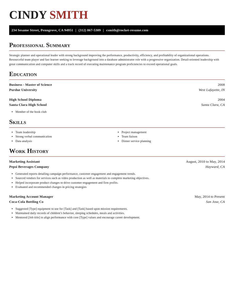
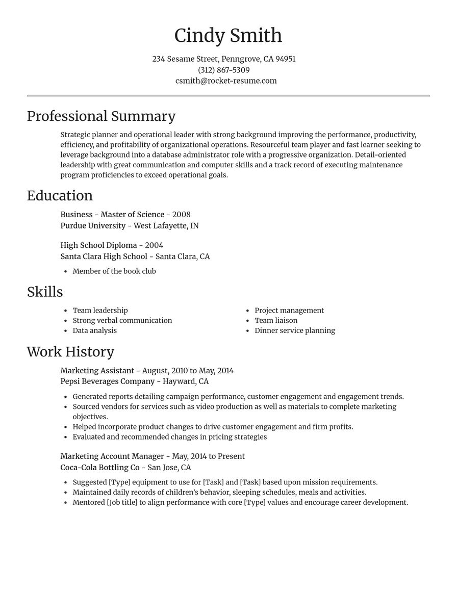
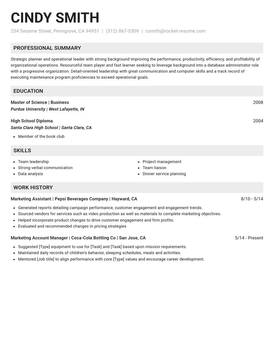
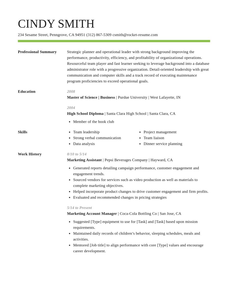
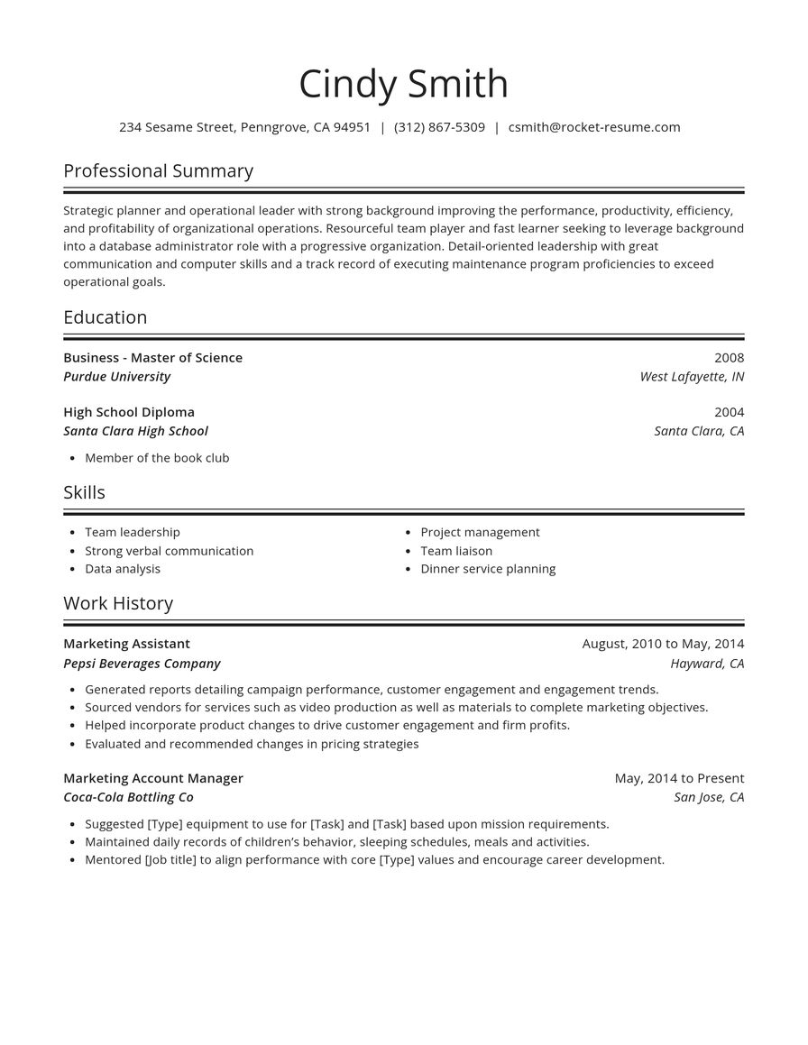
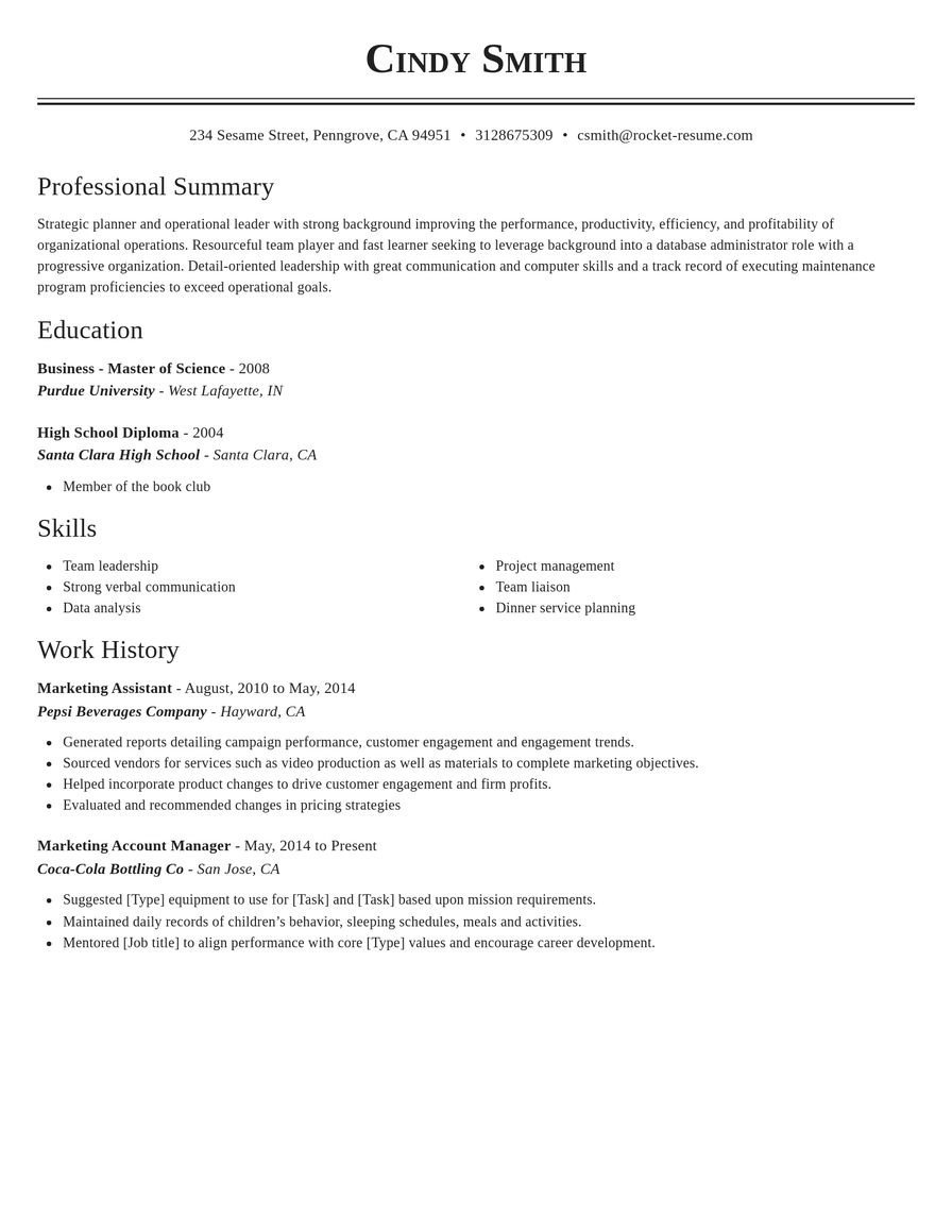
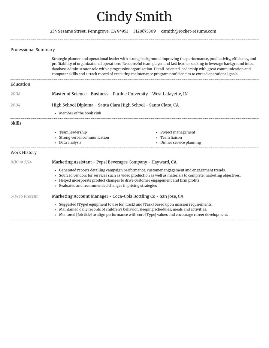
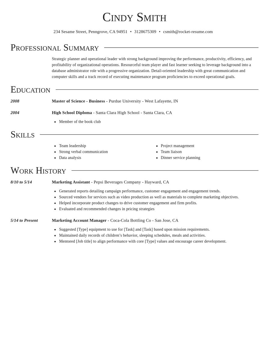
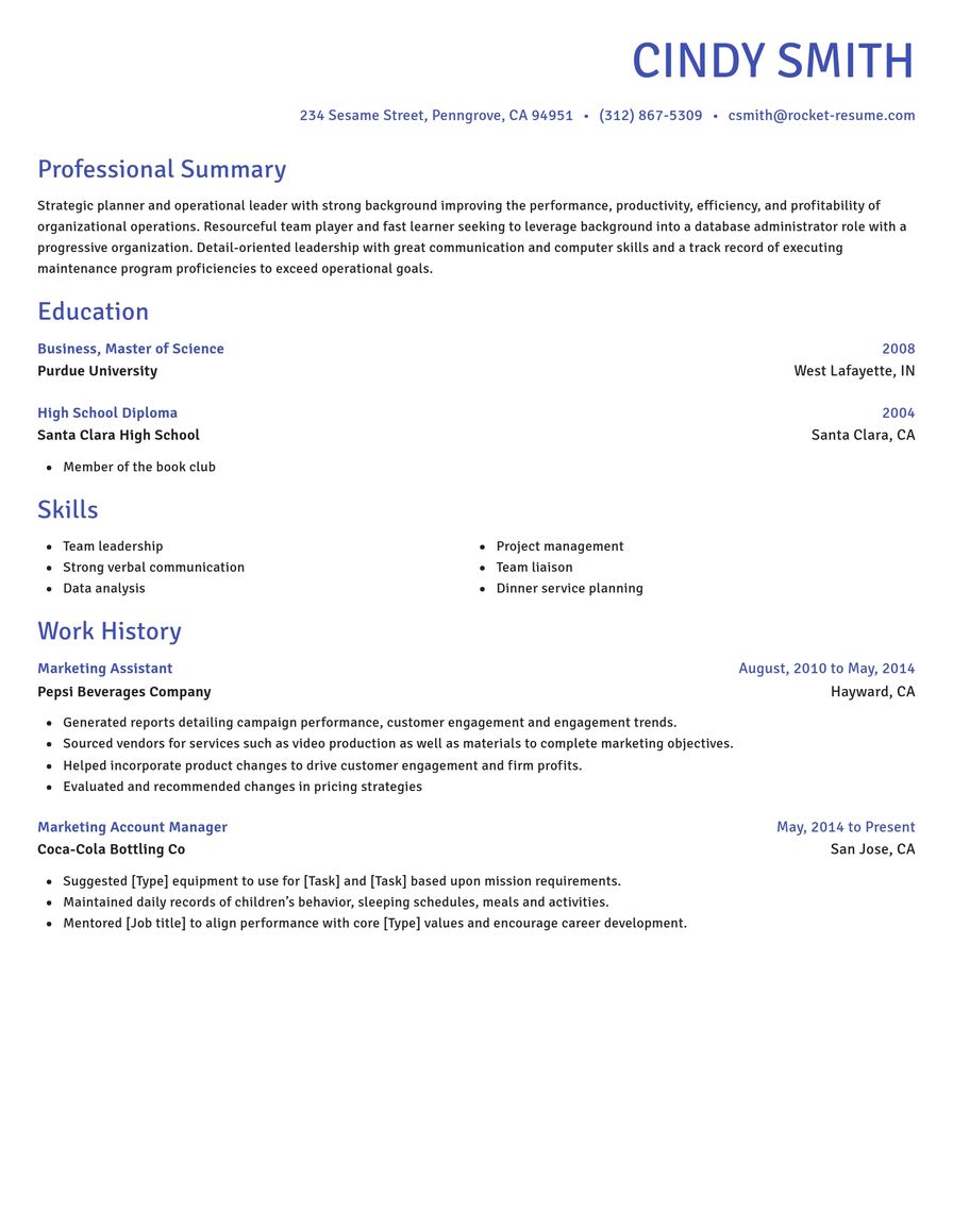
Pick a plain design to start
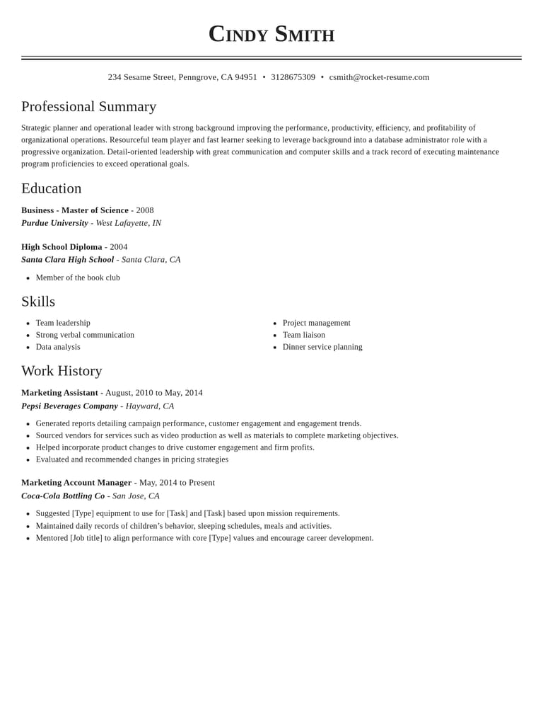
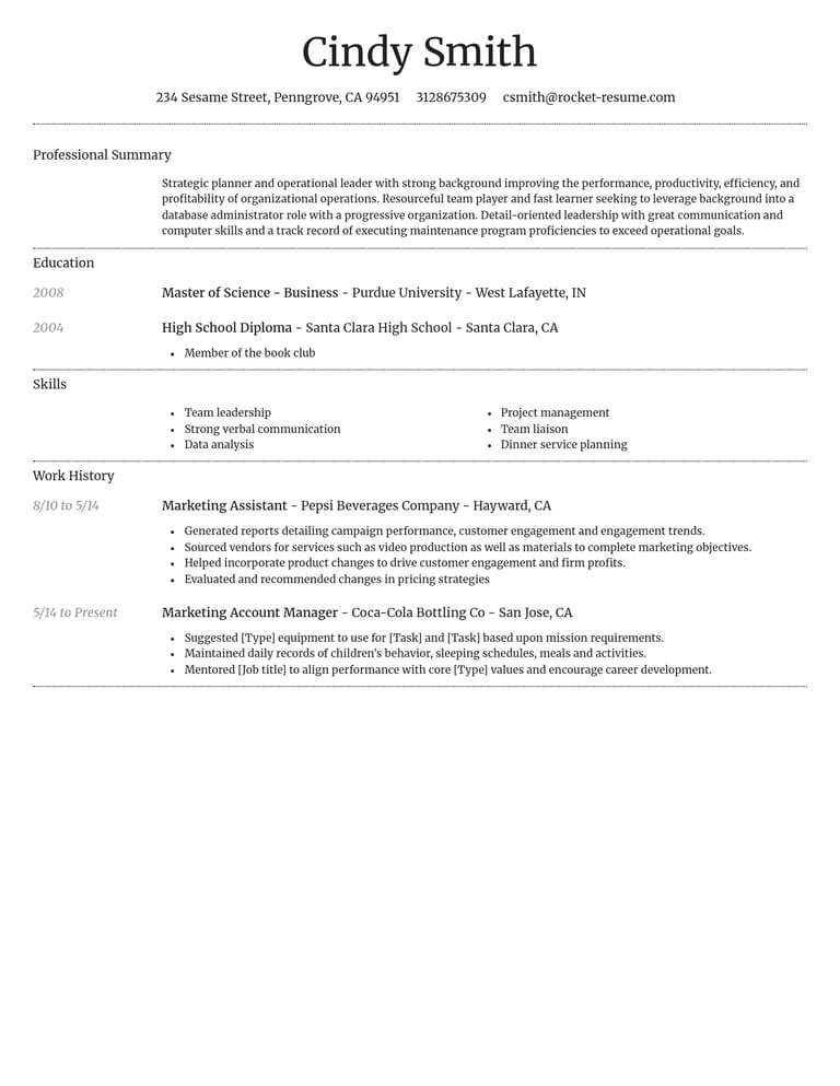
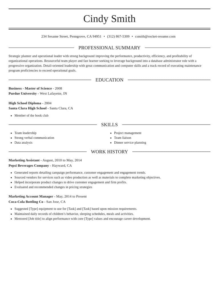
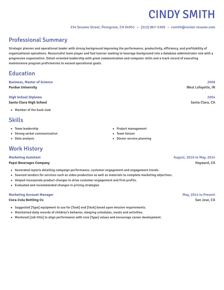
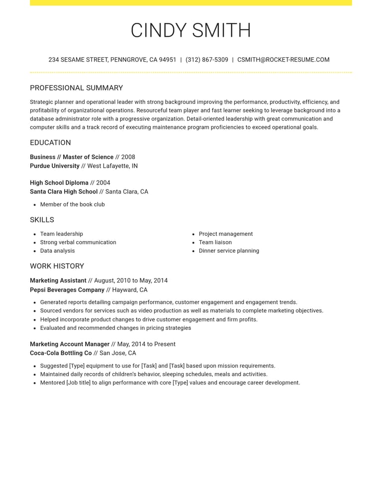
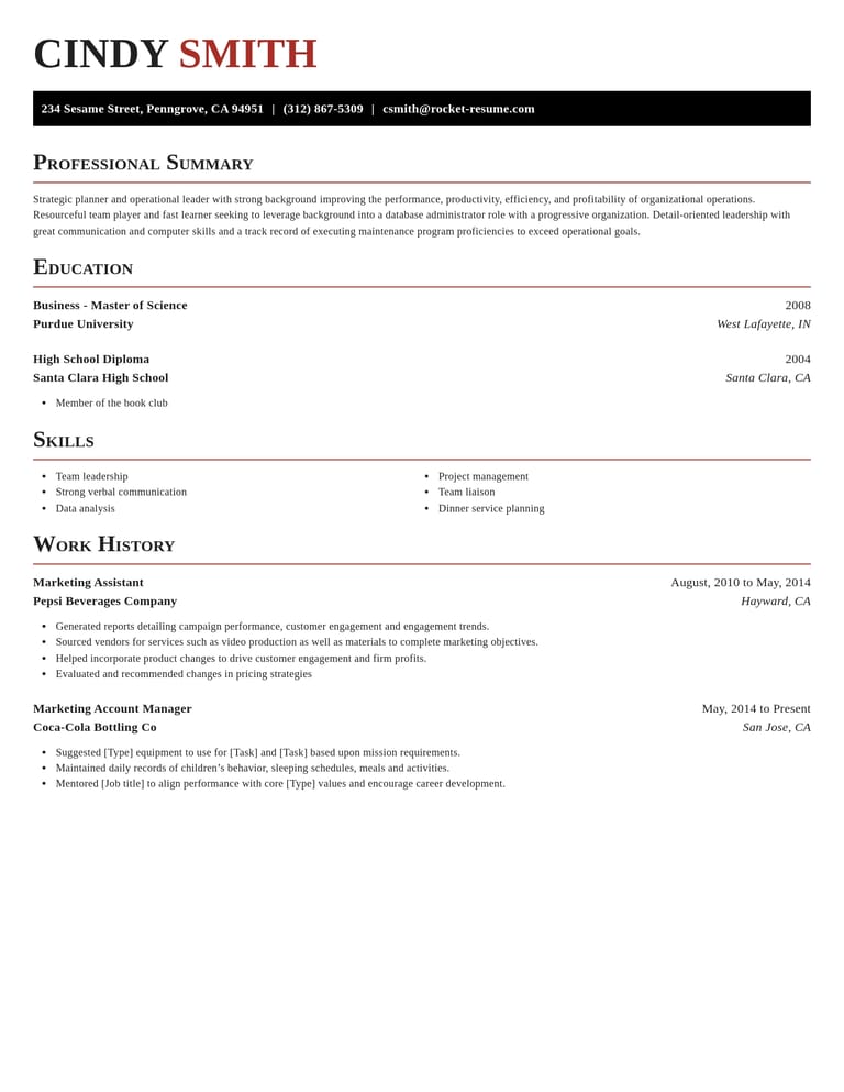
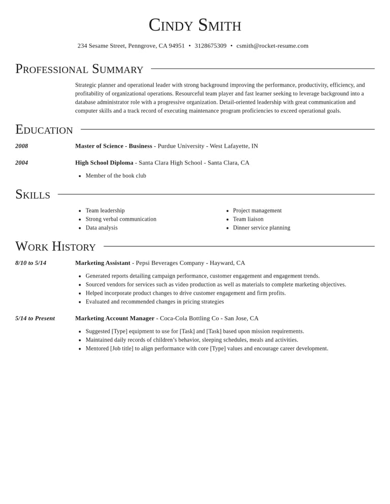
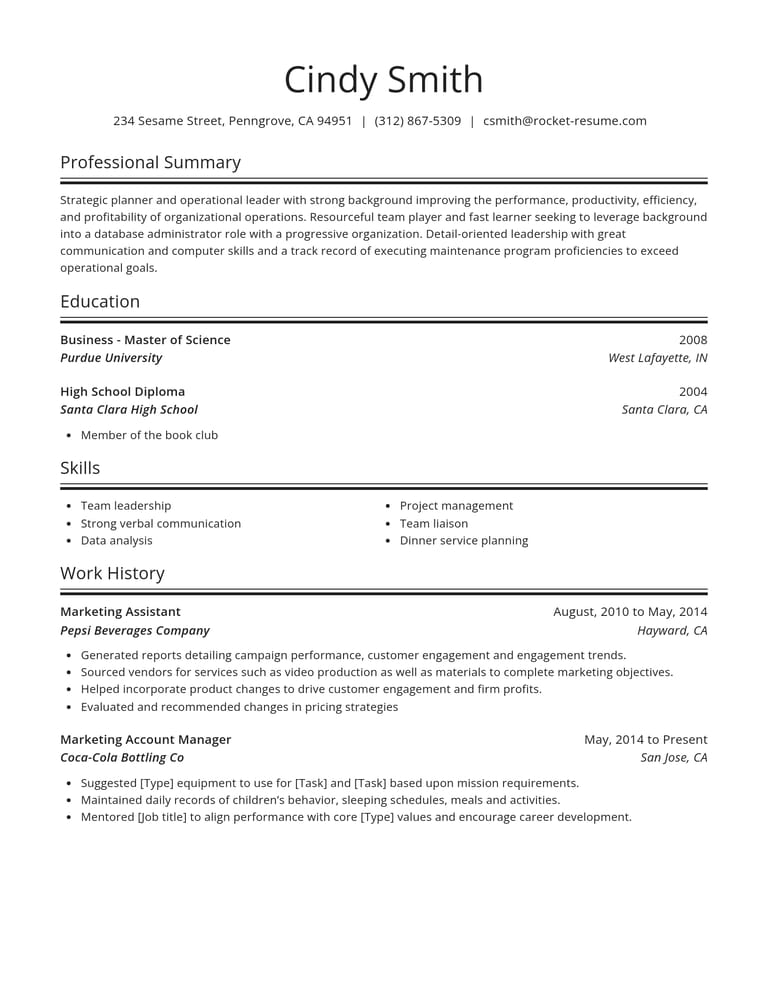
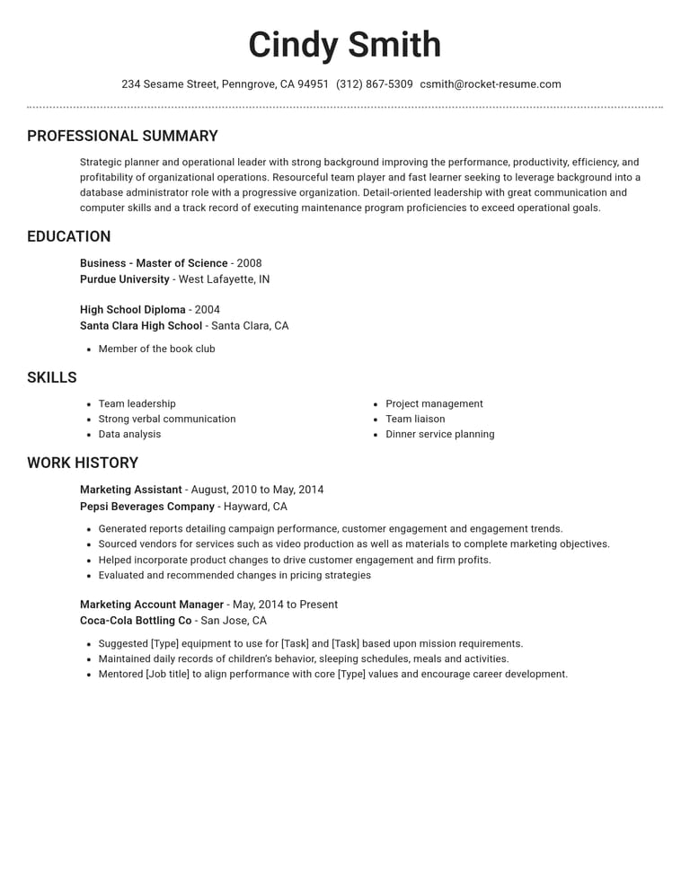
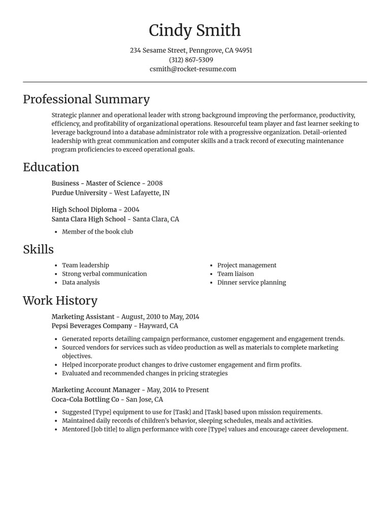
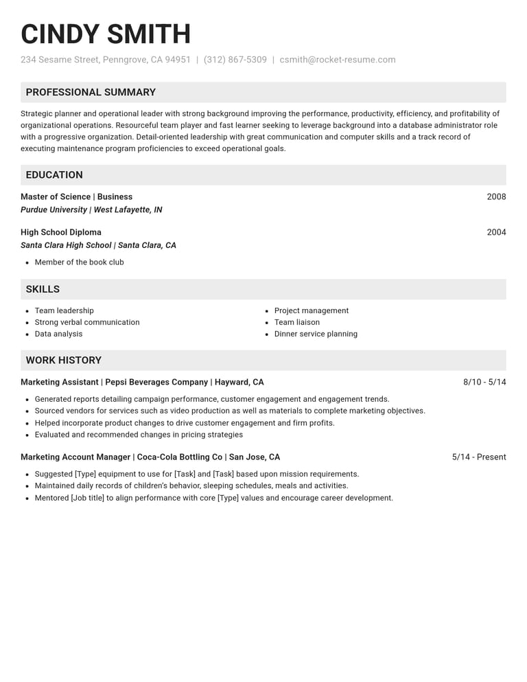
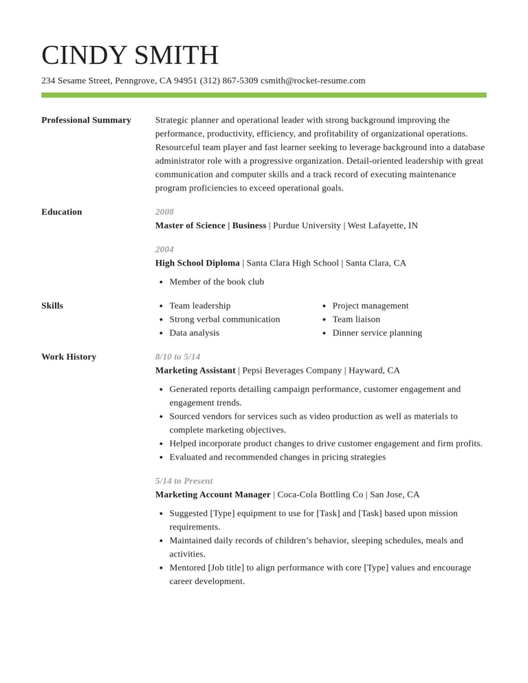
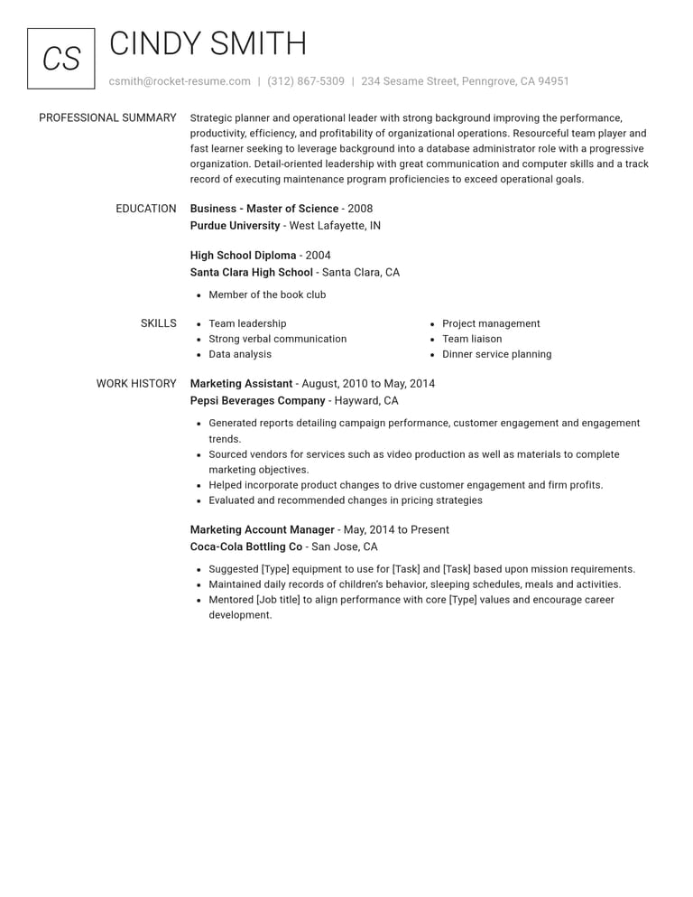
What a simple template does for your resume
A plain design keeps attention on your jobs and results. The builder handles the rest, from resume examples to spacing.
- Your experience comes first
With no graphics or shaded panels to look past, a reader's eye goes straight to your latest title and your best result.
- Headings people recognize
Work History, Education and Skills sit under their usual names, so recruiters and screening software find each section quickly.
- Spacing set for you
Margins, fonts and the gaps between sections arrive balanced. Add another job and the page keeps its shape.
- Suggestions for your role
Type your job title and pick from skill and work history examples, then reword them until they sound like you.
- Easy to follow on a phone
A single column reads straight down, which helps when a recruiter opens your resume on a small screen.
- Change your mind anytime
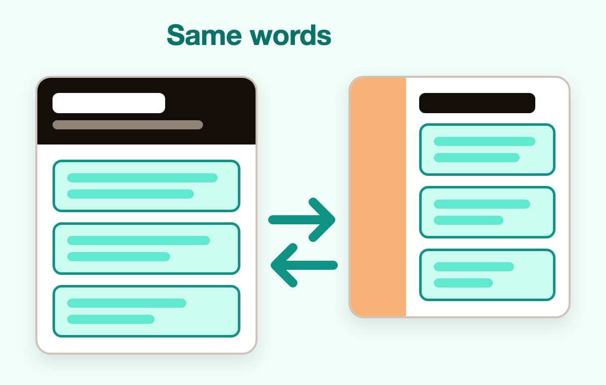
Try a different design whenever you like. Every word you've typed moves across, so comparing two looks is quick.
From a plain template to a finished resume
Step 1
Choose a plain design
Pick Classic, Dignified or another simple design, or answer one question about your experience and choose afterwards.
Step 2
Add your details
Enter your jobs newest first, then your schooling and skills. The builder's recommendations for your role give you a head start.
Step 3
Keep it tight
Cut any bullet that repeats another, move your strongest section up and check the spacing in the live preview.

Step 4
Finish and apply
Read the full page once more, save it to your account and send it with your applications.

Step 1
Choose a plain design
Pick Classic, Dignified or another simple design, or answer one question about your experience and choose afterwards.
Step 3
Keep it tight
Cut any bullet that repeats another, move your strongest section up and check the spacing in the live preview.
Step 2
Add your details
Enter your jobs newest first, then your schooling and skills. The builder's recommendations for your role give you a head start.
Step 4
Finish and apply
Read the full page once more, save it to your account and send it with your applications.
How to tell simple resume templates apart
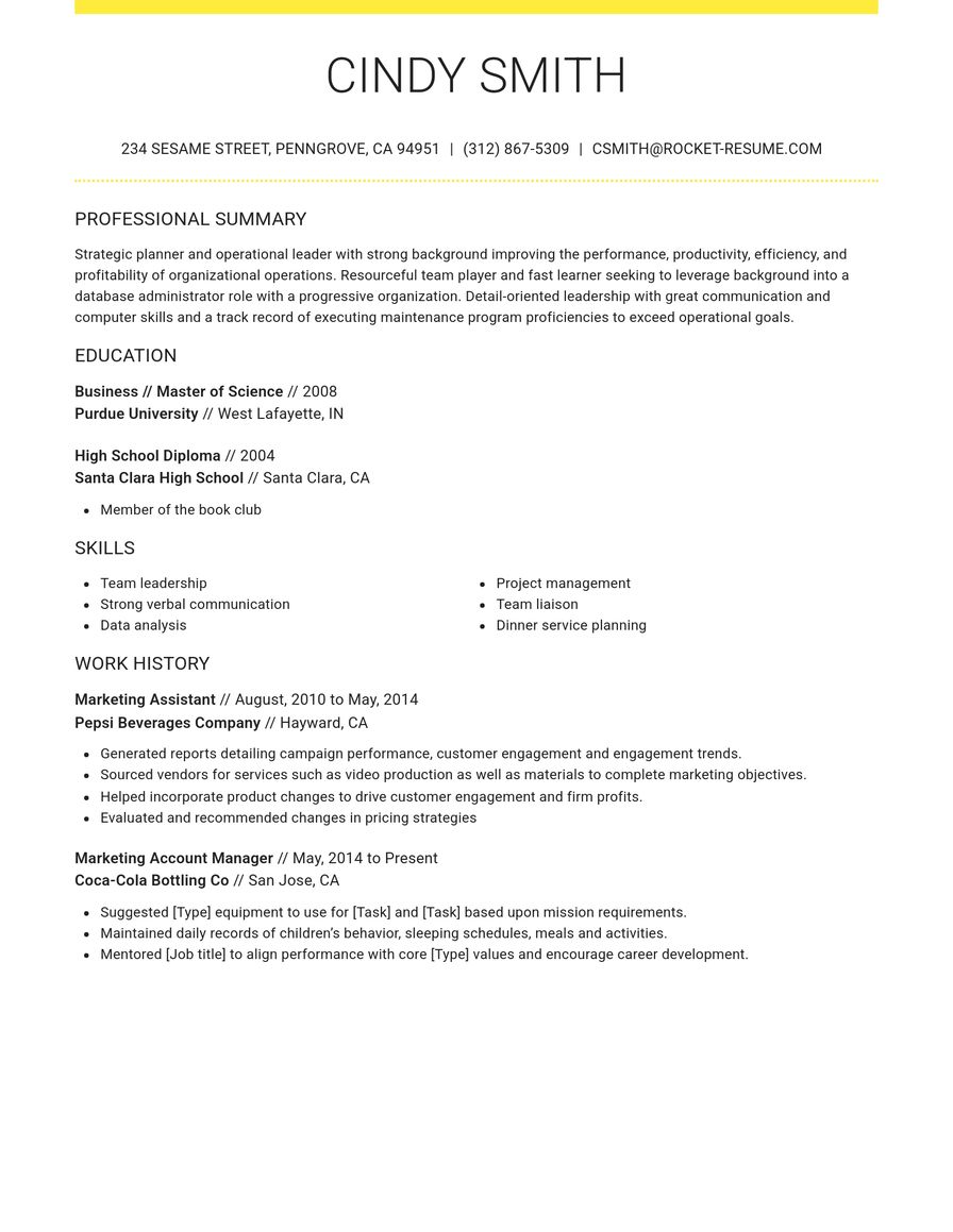
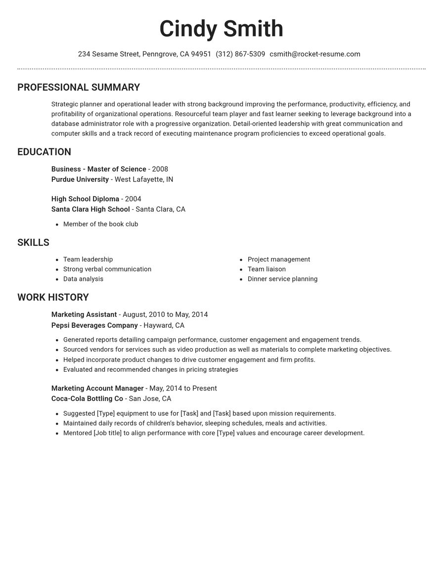
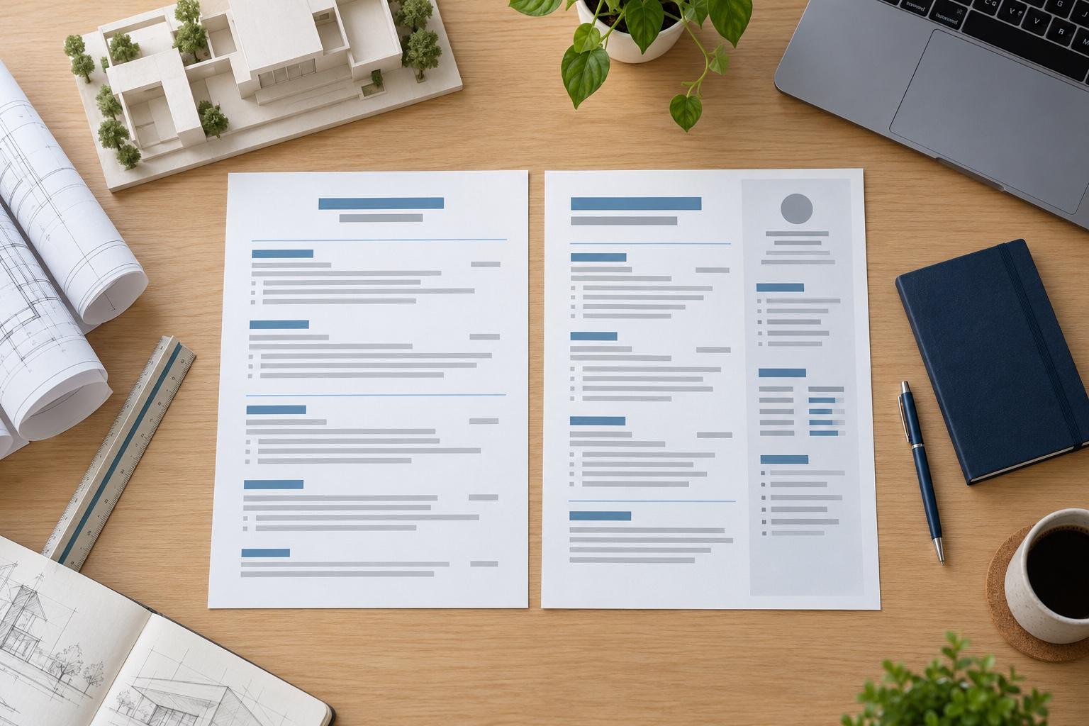
A simple resume template keeps the page plain so your experience does the selling: one or two typefaces, standard headings, generous margins and little or no color. Most designs that look simple share those basics, so the choice comes down to a few details that change how your resume reads. Compare them with your own details in place, not the sample text.
Should a simple resume use one column or two?
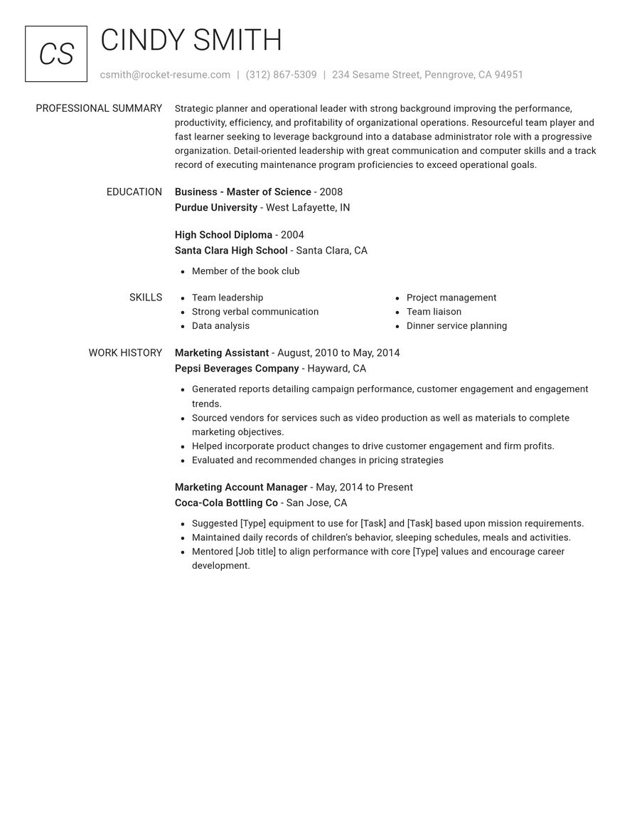
Pick one column if you want the plainest page. Everything runs straight down, so a reader moves from your summary to your latest job without jumping sideways, and a single column stays easy to follow when a resume is opened on a phone. Two-column designs put contact details or skills in a narrow side panel. They fit more on one page, which helps when you have a long list of tools or certifications, but the side panel competes with your work history for attention. Our article on whether to use a two-column resume covers when the extra column earns its place.
What separates one simple template from another?
Look at four details in the preview before you decide:
- The header: a centered name feels formal, while a name aligned left with contact details on one row saves space.
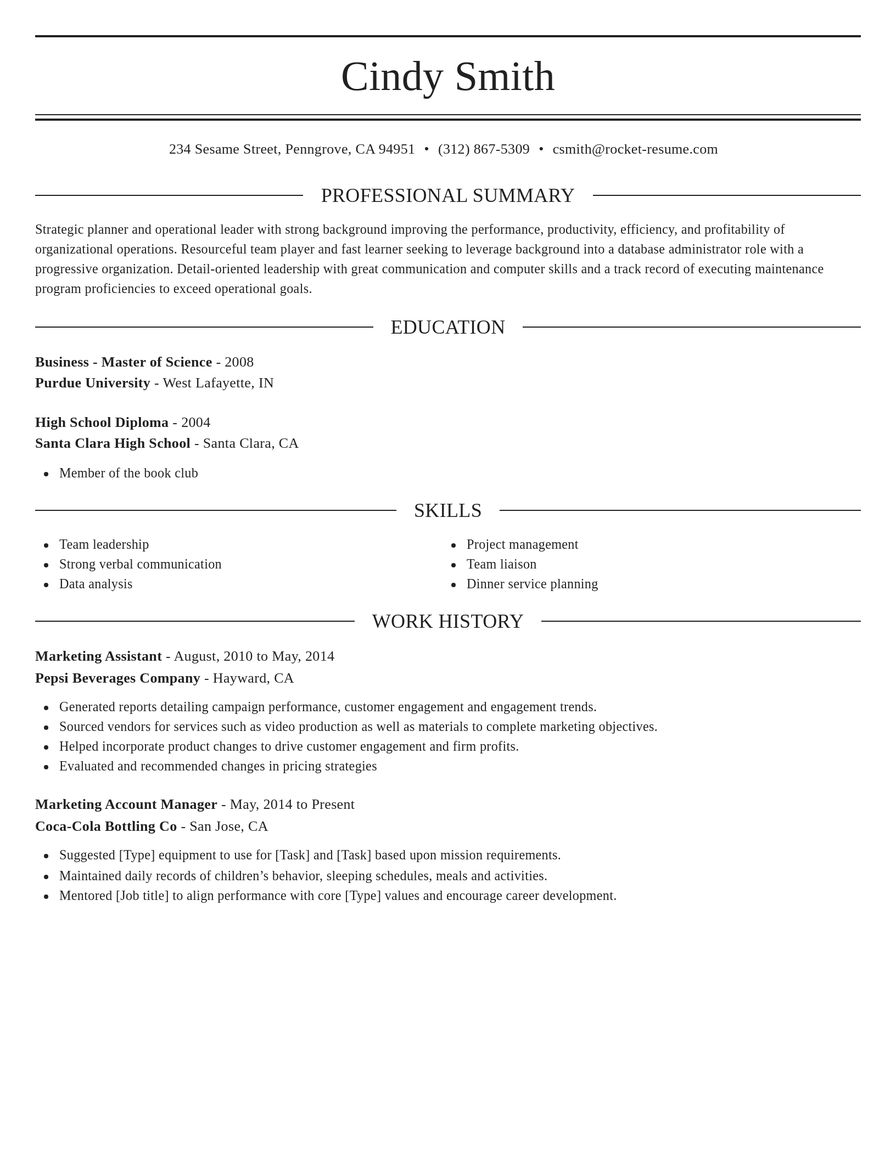
- The dividers: thin rules between sections give structure, and white space alone gives an even quieter page.
- The color: black and gray suit formal fields, and a single accent color on the headings adds warmth without clutter.
- The type: a larger name and bold section headings help a recruiter skim, as long as the body text stays easy to read.
Classic and Dignified are two of our plainest designs, with black text and thin dividers. Start there if you want the most traditional look, then compare one design that adds an accent color.
Does a simple template suit your field?
For most jobs, yes. Plain designs are the norm in finance, law, government, healthcare administration and the trades, where employers expect a traditional page. In sales, tech and most office roles, a simple design with one accent color looks current. Creative fields are the main exception: a designer or marketer may want a little more personality, though the same clean structure still applies underneath.
How much should you fit on a simple template?
Fill the page with substance rather than decoration. On a simple template the words carry the design, so aim for three to five bullets under each recent job, each starting with a verb and ending on a result where you have one. A short summary at the top and a skills section grouped by type give the page shape. With less experience, move education or projects higher and let the white space stay; a tidy half page reads better than a stretched one.
How do you test a simple template before you commit?
Put your real details in first, because sample text makes every design look tidy. Then check the page the way a recruiter will:
- Read only the section titles and the opening bullet of each. Your latest title and best result should stand out.
- Shrink the preview or look at it on your phone, and make sure nothing feels crowded.
- Switch to a second simple design and compare. Your words carry over, so this takes no retyping.
If both look good, choose the one that suits your field and move on to the wording. Our guide to what to put on a resume covers each section, and the ATS-friendly resume templates page explains how a plain layout helps screening software read your details.
Why a clear page matters when hiring is crowded
“My resume turned out great.”

“I really appreciate the quick response and help.”

Simple resume template questions
What is a simple resume template?
A design that keeps the page plain: standard headings, one or two typefaces, plenty of white space and little or no color. It sets the layout for you, so attention goes to your jobs, skills and results rather than to graphics.
Are simple resume templates ATS-friendly?
Ours are. Every design uses standard headings and typed text rather than images, a layout applicant tracking systems are built to parse. Screening setups vary by employer, so also mirror the job ad's wording for skills you really have.
Is a simple resume too plain for some jobs?
Only in a few creative fields, where a designer or marketer may want more personality. Even there, a simple design with one accent color works well, as long as each section is easy to find.
Should a simple resume fit on one page?
Usually. One page suits a first resume or a career in a single field. Go to two pages when older roles still prove you can do the job, and lead with your newest work.
Can I add a little color to a simple template?
Yes. A single accent color on your name or section headings adds warmth without clutter. Keep the body text black or dark gray so it stays easy to read, on screen and on paper.
Can I switch to a simple template after I start?
Yes. Change designs at any point and every word you've typed moves across. It's an easy way to compare a plain design with a bolder one before you decide.
Do simple templates work for experienced professionals?
Yes. A long career often reads best in a simple layout, because the reader can follow your progression without distractions. Keep the last ten to fifteen years in detail and sum up older roles in a sentence each.
See how resumes in your industry look
Featured this week

 6 examples
Machine Learning Engineer · Data Scientist · Computer Vision Engineer


 14 examples
Sales Manager · Inside Sales Representative · Technical Sales Representative
- 48 examples
- 8 examples
- 63 examples
- 21 examples
- 23 examples
- 15 examples






Show all industries (A–Z)Show fewer
- Aerospace & Defense, 8 examples
- Agriculture, 23 examples
- Apparel & Textiles, 13 examples
- Architecture, 15 examples
- Artificial Intelligence, 6 examples
- Arts & Entertainment, 24 examples
- Automotive, 21 examples
- Beauty & Personal Care, 17 examples
- Biotechnology & Life Sciences, 7 examples
- Business Services, 23 examples
- Chemical Engineering, 4 examples
- Childcare, 14 examples
- Construction, 106 examples
- Creative, 15 examples
- Customer Service, 17 examples
- Education, 94 examples
- Energy, 39 examples
- Environmental Science, 5 examples
- Finance, 63 examples
- Food & Beverage, 68 examples
- Government, 48 examples
- Healthcare, 160 examples
- Hospitality, 35 examples
- Human Resources, 18 examples
- Insurance, 10 examples
- Legal, 12 examples
- Logistics, 37 examples
- Manufacturing, 68 examples
- Marketing, 8 examples
- Media, 20 examples
- Military, 24 examples
- Mining & Metals, 9 examples
- Nonprofit, 8 examples
- Pharmaceuticals, 11 examples
- Public Relations, 10 examples
- Real Estate, 7 examples
- Retail, 38 examples
- Robotics, 11 examples
- Sales, 14 examples
- Security Services, 19 examples
- Social Services & Counseling, 21 examples
- Social Work, 14 examples
- Sports & Fitness, 96 examples
- Technology, 67 examples
- Telecommunications, 6 examples
- Tourism & Travel, 8 examples
- Transportation, 38 examples
- Veterinary, 9 examples
Don’t see your job title?

What people say after building a resume here
from 3,900+ reviews